Currently Empty: $0.00


Blog
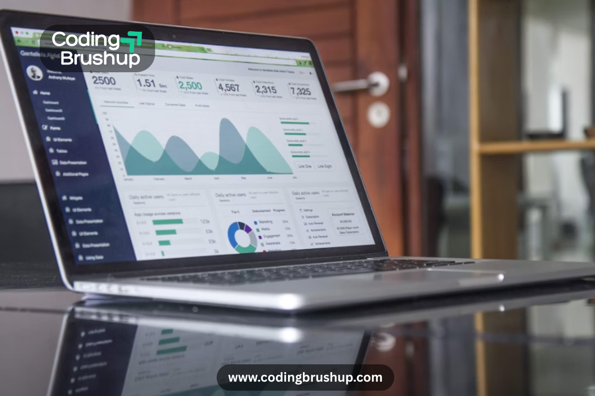
The Role of Data Visualization in Understanding Data Trends
Have you ever looked at a spreadsheet full of numbers and felt your eyes glaze over? You’re not alone. Raw data can be intimidating and, quite frankly, boring. But when those numbers transform into colorful charts, graphs, and dashboards, suddenly the story becomes obvious. That’s the magic of data visualization—the art and science of turning information into a picture that anyone can understand.
In today’s data-driven world, making sense of patterns, shifts, and opportunities is crucial. And guess what? Visualization is the key that turns endless rows of numbers into insights you can actually act on. So, let’s dive into why data visualization is essential in understanding trends, and how you can make the most of it.
Why Data Visualization Matters More Than Ever
We live in a world that generates 2.5 quintillion bytes of data every single day. From social media metrics to sales reports and website analytics, the real challenge isn’t collecting data—it’s interpreting it. That’s where visualization comes in.
Think about it: our brains process images 60,000 times faster than text. This means a line graph can show you instantly what might take paragraphs of explanation to describe. When you’re tracking data trends, time is money, and visuals cut through the noise.
Spotting Trends Made Easy
1. Seeing Patterns at a Glance
Imagine examining monthly sales data for an e-commerce store. In a raw table, numbers rise or fall, but it takes effort to calculate change. Plot those same numbers into a line graph, and—boom!—you can see seasonal spikes, growth plateaus, or sudden drops instantly.
Visualization helps you quickly spot what’s working, what’s not, and where adjustments are needed. Without it, you’re essentially solving a puzzle blindfolded.
2. Identifying Outliers That Matter
Trends aren’t just about averages; sometimes, the anomalies reveal more valuable information. A simple scatter plot can highlight unusual data points—like a sudden surge in traffic on one campaign or a product with unexpected returns. Recognizing these outliers can lead to smarter business strategies.
Interactive Comparison: Tables vs. Charts
Let’s take a quick example. Below is the same data presented in two formats.
| Month | Sales ($) |
|---|---|
| Jan | 40,000 |
| Feb | 42,500 |
| Mar | 60,000 |
| Apr | 35,000 |
| May | 70,000 |
Now, picture this as a line chart:
- January starts steady.
- February shows slight growth.
- March spikes dramatically.
- April dips down.
- May skyrockets again.
Which one was easier for you to interpret? Chances are, the chart stuck in your memory because visuals compress time and effort into instant insight.
The Business Impact of Visualization
You might be asking, “Okay, so visuals make things easy, but how does that impact real decisions?” Great question! Let’s look at three major benefits:
1. Better Decision-Making
When decision-makers see visual trends, they can act faster. For example, marketers tracking campaign performance on a dashboard can immediately spot underperforming ads and reallocate budgets.
2. Storytelling with Data
Data alone doesn’t inspire action. A CEO won’t rally the team with rows of spreadsheets. But show them a graph where customer satisfaction has doubled in six months, and suddenly there’s a story to celebrate. Visualization transforms raw information into compelling narratives.
3. Collaboration Across Teams
From sales to product development, visualization creates a common language of data. Even non-technical team members can understand charts and graphs, leading to more alignment and collaboration.
Top Tools to Bring Your Data to Life
Not sure how to start visualizing trends? Don’t worry; there are plenty of tools that make it simple:
- Tableau – Great for enterprise-level dashboards and deep insights.
- Power BI – Microsoft’s answer to interactive data analytics.
- Google Data Studio (Looker Studio) – A free, beginner-friendly option.
- Excel / Google Sheets – Perfect for quick and simple visualization.
The best part? Many of these tools let you build interactive charts, where users can filter and explore data themselves. That makes trends even easier to customize and understand.
Tips for More Effective Data Visualization
Now, before you jump in and start adding flashy charts everywhere, let’s talk strategy. Visualization works best when it’s clear, purposeful, and uncluttered. Keep these principles in mind:
- Keep It Simple – Avoid overloading your chart with too many categories or distracting colors.
- Pick the Right Chart for the Job – Use line charts for trends over time, bar charts for comparisons, and pie charts sparingly (they’re often harder to read).
- Focus on the Story – Always ask: What question am I answering with this chart?
- Use Consistent Scales and Colors – Consistency makes it easier for viewers to track and compare data.