Currently Empty: $0.00


Blog
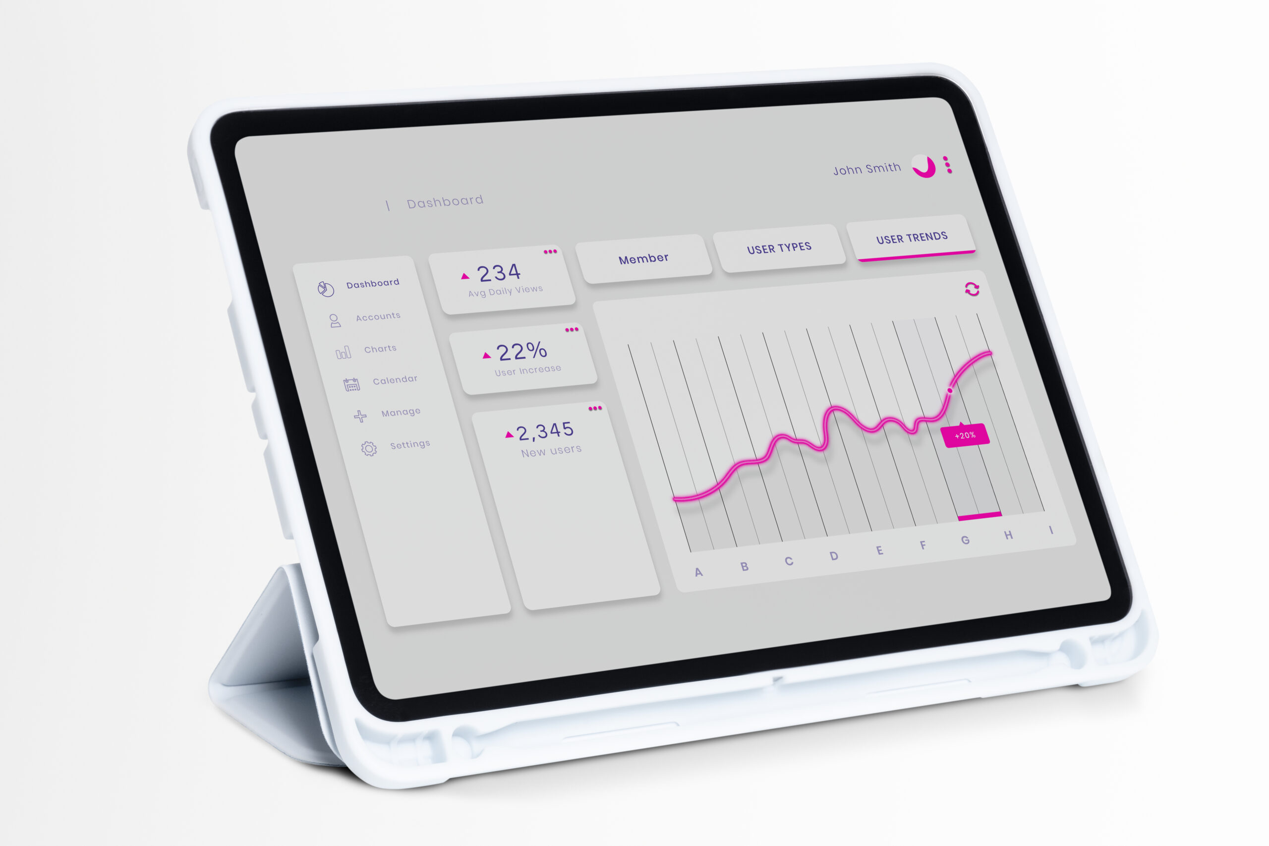
Ditch the Static Reports: How to Build Interactive Data Dashboards That Drive Action
Do your data reports remain stored in PDF format? Do your employees spend more time looking through spreadsheets instead of making educated decisions? If you’re looking at your colleagues and nodding then it’s time to step away from traditional charts, and take advantage of the potential of interactive dashboards for data.
A well-designed dashboard isn’t simply an array of beautiful graphs. It’s a powerful instrument that puts analysis of data directly in the hands of the decision makers. It allows you to cut and dice, filter and drill down to insights in real-time. This immediate feedback loop can be described as the difference between knowing what transpired last quarter, and taking action based on what’s happening now.
If you’re eager to revolutionize the way your team consumes and utilizes data, and become the data champion of your business, this guide will help you get there. We’ll guide you through the fundamental steps, the essential tools and design concepts to create data dashboards that aren’t just pretty but also drive substantial business outcomes. Let’s get building!
The Foundation: Why Interactivity Matters
Before we purchase any software, we must to know the primary benefits of making a dashboard interactive. It encourages the ownership of data as well as faster decisions.
Moving Beyond Passive Consumption
An unstructured report can be described as inactive. The viewer only consumes what you, the analyst thought was essential. A dashboard that is interactive however, is in actively working. It lets users answer any follow-up questions without having to bother the user.
Imagine an executive in sales looking over the data on revenue. Instead of contacting you to inquire, “But what about the Northeast region’s sales just during Q3?” They can select a filter that includes “Northeast” as well as “Q3.” This self-service model helps everyone save time and increases the process from idea to decision.
- The most important features of interactivity are filters drill-downs (clicking on a summary number to reveal the details) and tooltips that provide the context of hovers, and time-range selection.
What is the single follow-up question you receive frequently after presenting the static report? An interactive dashboard can eliminate it!
Choosing Your Dashboard Power Tool
The range of dashboard tools is huge, however, they typically are divided into two categories two categories: specifically designed BI platforms and solutions based on code. Your decision will be based on your team’s technical capabilities and budget as well as the desire for customisation.
Comparing Popular Dashboard Tools
To help you determine which areas to put your energy and money, let’s take a examine the most important characteristics of the most popular platforms:
| Tool Category | Platform Example | Best For | Learning Curve | Primary Advantage |
| Business Intelligence (BI) | Tableau / Power BI | Non-coding teams, enterprise-level governance. | Moderate to High | Drag and drop ease, strong connections to data. |
| Code-Based Framework | Streamlit / Dash (Python) | Data Scientists, rapid prototyping Internal tools. | Low to Moderate | Deep Python integration, quick deployment of ML results. |
| SQL/Visualization | Looker Studio (free) | Teams and startups that are focused on data derived from Google (GA Sheets). | Low | Free, great integration with Google ecosystem. |
If you’re an Data Scientist, platforms like Streamlit or Dash permit you to link the data from your Machine Learning models directly to the web using just Python. No HTML, CSS or JavaScript is required! If your company is dependent on drag-and-drop visualizations and governance for the enterprise using a BI tool, it’s the right choice.
Design for Clarity: The Visual Hierarchy
An error that is common is trying to fit too much information on the same screen. High-performance dashboards are focused on and not quantity.
Less is More: The One-Screen Rule
The most crucial information, your KPIs (KPIs)–should be visible immediately without scrolling. If users are forced to look for the central metric the dashboard is already failing.
- The F-Pattern: Most people browse the screen using the pattern of an “F” (top left, bottom, and then across). Set your most crucial summaries (e.g. the total revenue and the number of active daily users) in bold, big figures at the top left corner of your screen.
- Color as Action Utilize color sparingly and in a meaningful way. Colors that are bright and contrasting (like green and red) to provide alerts or indications of how you’re performing against a target but not to help categorize. For instance, only use the metric green when it’s above the target and not only because it’s an X number.
Look at your current dashboard. Are you able to identify the three most important numbers in just five seconds? If not, you should rethink the order!
Powering Interactivity: Connecting the Data
Interactivity is based on a well-structured model of data and advanced filtering capabilities. This is the point where the field of data science intersects with visualization.
Efficient Data Models for Speed
The performance of your dashboard is on how fast the query that runs it. For interactive dashboards, avoid complex, slow-running JOINs. Instead, improve your database or data warehouse by:
- Pre-Aggregating Data: When users often filter data by region or month, you can pre-calculate the sums for the respective dimensions rather than making them live each time.
- Utilizing Filter Widgets Make your dashboard layout so that it includes clearly marked filtering options (date interval, categories or region, category,). The filters should update dynamically all charts that are related to them displayed on your page so that each visual tells the same narrative based on the choice of the user.
Remember: Each click on the filter results in the creation of a new query. You should improve both your queries and database connectivity to be able to respond within a fraction of an instant for an extremely fluid, high-performance experience.
Launch and Iterate: The Dashboard Lifecycle
Making the dashboard is just the first step. To keep it up and running, you must conduct a continuous evaluation and re-design in response to user feedback.
Measure Success and Gather Feedback
When your dashboard is up and running Don’t leave it! Keep track of how often it’s used and which features are the most well-liked.
- User Testing: Meet with your intended group of users (the staff of sales, executives) and observe them using the dashboard. What areas do they struggle with? What are the questions they can’t answer?
- Usage Metrics: Create basic analytics to determine the most popular charts as well as which filter is utilized the least. If a chart has never been used, you may need to delete or modify it.
Interactive dashboards are dynamic documents. Through soliciting feedback and implementing frequent, incremental changes to your dashboard, you can ensure that it remains current, efficient and essential to making decisions across your business.
Ready to Make Your Data Dynamic?
The move of static reporting to dynamic dashboards are crucial for every modern team that relies on data. By focusing on clarity, choosing the most appropriate tool, paying attention to visual hierarchy and making sure that your data connections are fast it is possible to create tools that will save hours of time for analysts and enables quick, reliable business decision-making.