Currently Empty: $0.00


Blog
Stop Breaking the Web: Your Guide to Implementing Responsive Design Like a Pro
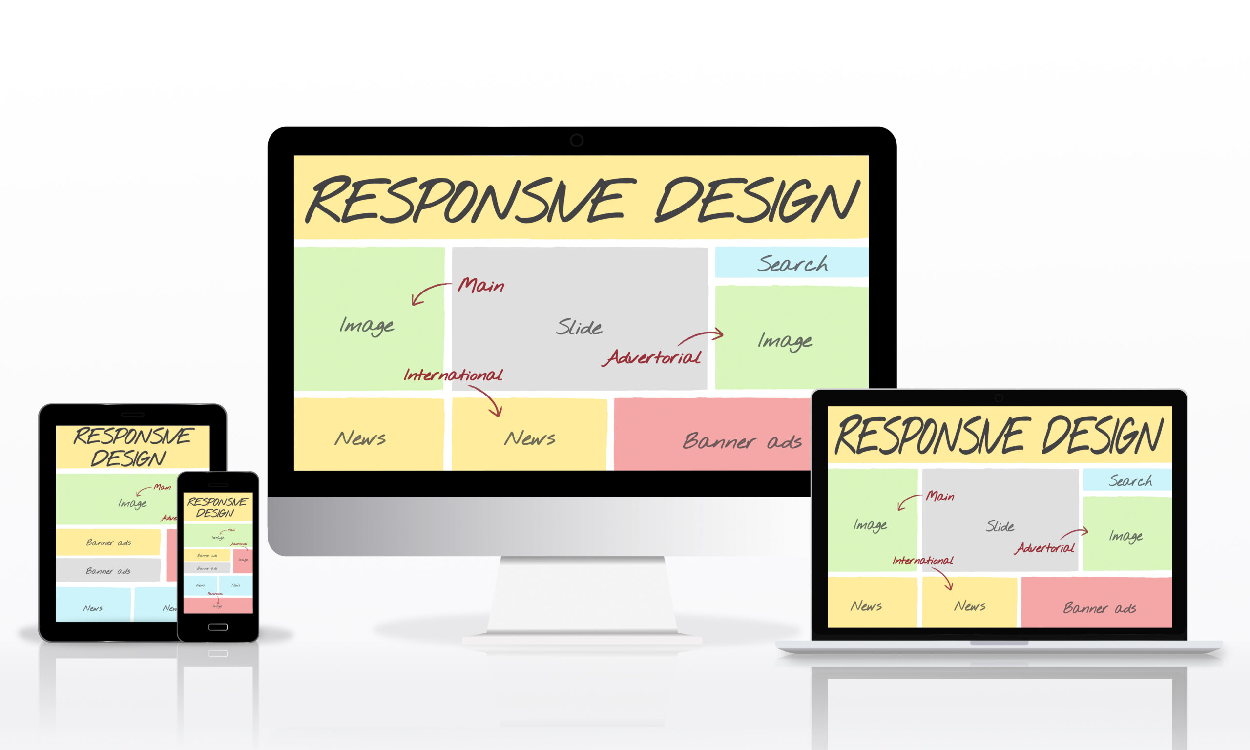
Have you ever opened a beautiful website on your phone, only to find the text overlapping, the images stretching off the screen, and the navigation menu impossible to click? If so, you’ve witnessed the failure of non-responsive design.
In today’s world, over half of all website traffic comes from mobile devices. This isn’t just a trend; it’s the new reality. Suppose your website doesn’t seamlessly adapt its layout, images, and content to fit every screen—from a small smartwatch to a massive desktop monitor—you’re not only frustrating users. In that case, you’re actively being penalized by search engines like Google. Responsive design is no longer an optional feature; it’s an essential technical requirement for success.
Ready to build websites that look fantastic everywhere and finally earn that crucial “mobile-friendly” badge? This guide breaks down the core concepts, essential tools, and professional CSS techniques you need to implement truly responsive design in all your web projects. Let’s start building a web that works for everyone!
The Foundation: Why Responsive Design Isn’t Just for Mobile
Responsive Web Design (RWD) is an approach that suggests design and development should respond to the user’s behavior and environment based on screen size, platform, and orientation. This philosophy centers on three core ingredients: fluid grids, flexible images, and media queries.
Start with the Viewport Meta Tag
Before writing a single line of responsive CSS, you must include this critical piece of HTML in the <head> of your document:
HTML
<meta name=”viewport” content=”width=device-width, initial-scale=1.0″>
This tag instructs the browser to set the viewport width equal to the device’s screen width and sets the initial zoom level. Without this line, many mobile browsers will default to rendering the page at a typical desktop width (usually 980px), leading to a tiny, zoomed-out mess.
Embrace Relative Units for Fluidity
Forget fixed pixel values! The cornerstone of a fluid layout is using relative units.
- Fluid Grids: Use percentages (%) or the viewport units (vw, vh) for widths, margins, and padding instead of fixed pixels (px). This ensures your layout components scale relative to the screen size. For example, setting width: 50%; ensures a component always takes up exactly half the screen.
- Flexible Text: Use rem or em for font sizes. These units scale relative to the root font size or the parent element’s font size, making text easily adjustable for accessibility and different viewports.
If you checked your latest project, how many fixed pixel widths did you find? Reducing those is your first step toward true fluidity!
The Magic Tool: Mastering CSS Media Queries
Media Queries are the most powerful tool in RWD. They allow you to apply CSS styles only when certain conditions are met, most commonly when the screen reaches a specific size (a breakpoint).
Adopt the Mobile-First Philosophy
A professional tip: always start coding your layout for the smallest screen size first (mobile). This is the mobile-first approach.
- Define Base Styles: Write all your HTML and CSS for a single-column mobile layout. This ensures the fastest load time for mobile users and forces you to prioritize content.
- Add Breakpoints Up: Use media queries to introduce layout changes only when necessary to adapt to larger screens.
CSS
/* Mobile-First: These styles apply to ALL screens, starting with mobile */
.container {
width: 100%;
padding: 10px;
}
/* Breakpoint for Tablets and up (min-width) */
@media (min-width: 768px) {
.container {
max-width: 750px; /* Constrain on larger screens */
display: flex; /* Introduce a complex layout */
}
}
Using min-width queries ensures that styles build upon each other, simplifying your CSS and keeping it organized.
Layout Power: Flexbox and Grid for Seamless Adaptation
The days of struggling with CSS floats are long over. Modern responsive layouts are powered by Flexbox and CSS Grid.
Flexbox for Single-Direction Adaptability
Flexbox is perfect for arranging items in a single line (row or column) and controlling their spacing and alignment. Use it for elements like navigation bars, form inputs, or content cards.
- Key Flexbox Properties:
- display: flex;: Turns the container into a flexible box.
- justify-content: Controls spacing along the main axis (e.g., space-between).
- align-items: Controls alignment along the cross-axis (e.g., center).
- flex-wrap: wrap;: The essential property that allows items to drop to the next line when space runs out, preventing overflow on small screens!
CSS Grid for Two-Dimensional Control
CSS Grid is the ideal tool for defining the overall page structure (header, sidebar, main content) because it works in two dimensions (rows and columns simultaneously). You can redefine the entire page layout at a new breakpoint with just a few lines of CSS.
- The Power of fr units: The fr (fractional) unit makes grid columns fluid. For example, grid-template-columns: 1fr 3fr; creates two columns where the second column is three times wider than the first.
Images, Media, and Typography: Avoiding Visual Breakage
Even if your layout is perfect, non-responsive images and illegible text can ruin the experience.
Ensuring Fluid Media and Image Load
Your images must scale down dynamically. The simplest, most effective CSS rule you can apply to almost all images is:
CSS
img, video {
max-width: 100%; /* Prevents image from exceeding its parent container */
height: auto; /* Maintains aspect ratio */
}
This ensures that media elements will never overflow their container while correctly preserving their aspect ratio. For truly high-performance sites, consider using the HTML <picture> element along with the srcset attribute to deliver different, optimized image sizes to different devices.
Summary: RWD Tools and When to Use Them
Knowing which tool to apply when is key to an efficient workflow.
| Technique/Tool | When to Implement | Primary Goal Achieved |
| Viewport Meta Tag | Always (First line of <head> HTML) | Enables mobile scaling and RWD recognition. |
| Percentage/VW Units | Layout containers, widths, and margins. | Creates fluid grid systems that adapt seamlessly. |
| @media (min-width: …) | When layout changes are needed at specific sizes. | Applies styles conditionally (Mobile-First approach). |
| display: flex; | Arranging items in a row (e.g., navigation bar). | Controls alignment and spacing in one dimension. |
| display: grid; | Defining overall page architecture (e.g., header, sidebar). | Controls layout structure in two dimensions. |
| max-width: 100% | All images and video elements. | Ensures media scales down and avoids overflow. |
Ready to test your knowledge? Try to structure a page using CSS Grid and then use Flexbox inside one of those Grid areas. This combination is the hallmark of a responsive expert!
Your Next Step: Test, Test, Test
Implementing responsive design is an absolute must for modern development. By embracing fluid units, starting mobile-first, mastering Flexbox and Grid, and optimizing your media, you will build applications that work perfectly for every single user, no matter what device they choose.
Now that you have the tools, the final step is testing. Use your browser’s Developer Tools (F12 or Ctrl+Shift+I) and switch to the device emulation mode. Check your layouts, images, and text at various widths.